
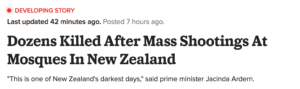
I am following the coverage of the shooting at Christchurch New Zealand, analysing the approach of Buzzfeed News. Their article, “Dozens Killed After Mass Shootings at Mosques in New Zealand,” presents both strong and weak points.
DEVELOPING STORY
The first thing I noticed is that Buzzfeed has published this as a “developing story,” with an animated blinking marker on top of the headline to note this.
I think this is a good interactive approach, especially for the reader, who will be able to see the whole story unfold just by scrolling.
However, I find it a bit disarming when the order of the stories is presented in reverse-chronology. Not all readers are keeping up with the story in real time, so this presentation can be quite confusing.
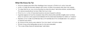
WHAT WE KNOW
A good facet is that Buzzfeed starts the entire piece with a bullet point summary of “What we know so far,” giving readers the opportunity to get a basic overview.
WHAT’S THE BUZZ AROUND IT?
Buzzfeed also borrows a lot of content from social media, hyperlinking tweets from relevant people on the topic.
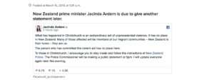
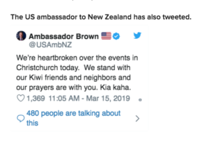
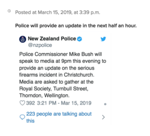
However, I find that this aspect feels a little cluttered, as some of the tweets seem unnecessary and hardly give any insight into the investigation.
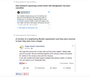
Such as these sentiments of well-wishes from sports teams.
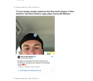
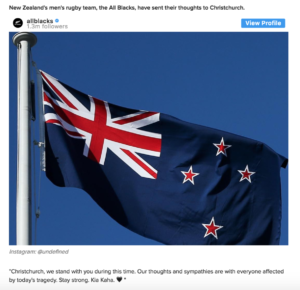
While the tweets give dimension to the story, it doesn’t feel like they are urgent for me to know as a reader.
CAPTION THIS
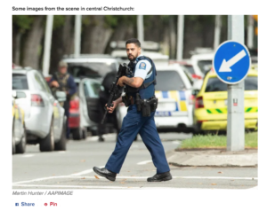
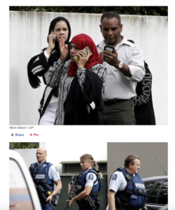
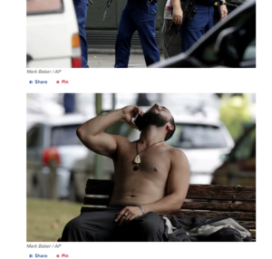
They can afford to cut out unnecessary information, and instead focus on providing an in-depth investigation on the suspects, the attack, and more-so, its victims. I think the story fails to provide this, as even a series of photos that have been released fail to be captioned and provide context.
Great observations Kara. This is a page of live updates, rather than a news story, which is why it feels cluttered. I agree with you about the captioning and also find the linking of verb phrases odd, as they could be using keyword phrases. I wonder if they are trying to use the hypertext as act of speech act attribution? The Google map of the area was great because it look us closer to the location of the attacks.
On your web-writing: Good overall. In future, please keep links short and make them open in new tabs. You also needed to set alt text for your feature image. Don’t forget to add keyword tags for external search discovery, and use your precede (subheading field below post) to promote your post. Finally please upload an image of yourself to your blog bio to elicit trust from your readers.